People always ask if we develop websites. We do, but for us, developing a beautiful website is more of a means to an end than the ultimate end goal. You have to have a website that makes sense for your business, looks great, and works before we can start driving traffic to it that eventually turns into sales. There are many tools out there that have made building a great looking website fast, cheap, and fairly easy. Mopro is a great resource for small business owners looking to modernize their look quickly, and they even have some added support. Plus, it only costs $199/mo. They can add stock images that move around the homepage or video for an added flare. Otherwise, yes, we can build you a custom website if it’s a good fit or refer you to a company that specializes in what you're after, depending on your needs.
Clear Value Proposition
The hard part in a website build is often the research required before picking a design—whether it's a template or custom—to simplify your value proposition quickly and in a way that peaks visitors’ interests. The Internet has opened up the flood gates for increased competition and shifted the power to consumers. The more specialized you can be and the more concisely you can say "We are THE company for X," the more successful your website, and therefore business. Anyone who has ever written anything knows that for many, saying something in fewer characters can be much more difficult than saying it in more.
Homepage Use
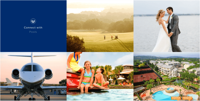
Once you have that down, you're done with half the battle! Next, you'll want to think, with my clear value proposition, what will most people want to do on our homepage and (better yet) what will we want them to do? Think of the stages of the buyer's journey. Is your business like an airline where when you go the website it's generally because you want to check out flights or you are ready to book? If you had to search for where to plug in your dates and destination on an airline's website (such as American Airlines or Southwest Airlines) that would be really annoying and you'd probably give it a maximum of five seconds before you left and went to another travel site. On the other hand, if you heard about Horseshoe Bay Resort and visited to the website to think about going there for a summer vacation, you probably would want to check it out and really research if between the value + price + dates, it's a good fit for you and your family. Therefore, they make it easy to check availability at the top but leave the rest of the homepage dedicated to showing the resort’s value in a beautiful, concise way.
Along with your typical buyer's journey, you will also want to keep buyer personas in mind to answer questions such as does it make sense to have smart content? That means that based on information that you know about a viewer, the website homepage can actually look different.
Once you've done your research, you can start to figure out some website designs you like and think would be relevant for your specific value proposition, your buyer's typical stage of their journey on your homepage, and what your different primary personas might be looking for when they get there. Don't be afraid to look at websites unrelated to your industry for different ideas. Generally, all websites in an industry start to look alike because everyone's scared to be the first to do something different...but then you lose that first key to a great website which is emphasizing your company's value proposition and differentiating to stand out from the crowd.
Having said all of that, here are a few websites that I think have some great elements in regards to design and conversions, regardless of industry:
Horseshoe Bay Resort
They have a great mix of relevant content for various stages of the funnel on their homepage (and no shortage of pages to explore). I particularly like their block section that emphasizes different favorite activities and changes when you hover of them. This helps keep the page moving and creates a clean look while also being functional by clarifying where a user will be if they click on a block. The first dark blue square even swaps out smoothly through all of the various categories in that one. This moving or flipping of images in blocks has been a trend for a few years in ecommerce but it’s a little less common to find it on other kinds of websites.
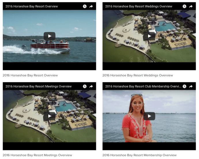
On a side note, I also really like their resort gallery page that not only has great images but also a handful of videos that are helpful to someone still deciding if they want to book their trip.
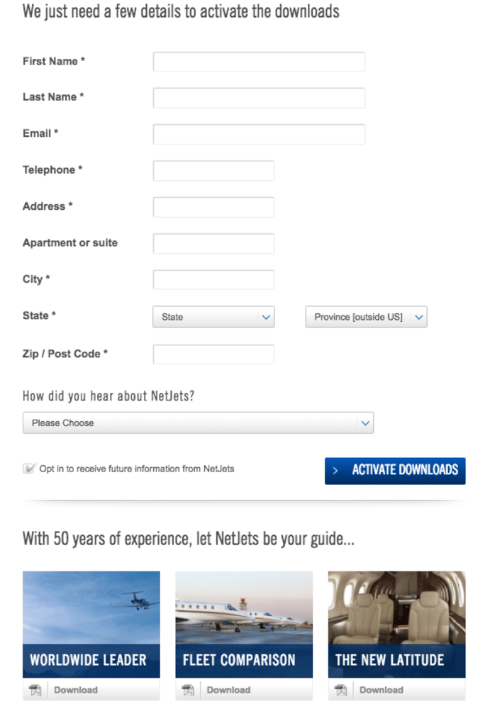
NetJets
The NetJets website is clean and call-to-action oriented. It has kind of a standard homepage slider but looks sleeker than the usual ones. The photography is great and I especially love how the phone number easy to find, as that is probably a preferred method of contact for the bulk of their customers. I've also never seen a form to download multiple downloads at once, which is smart.
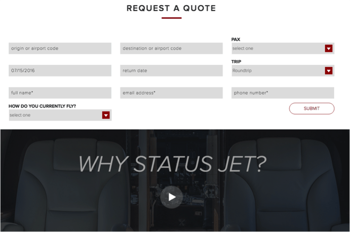
 They also clearly address their prospects’ major evaluation-stage questions with the site navigation and the three boxes below the sliders that ask visitors to click to request information, learn about shares, or learn about what they call their marquis jet card. StatusJet is a similar site that has a lot of great conversion opportunities that speak to different stages and buyers, plus their homepage includes a video, which is always an added plus as a user in today’s world.
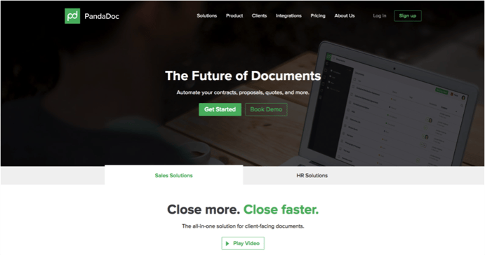
Pandadoc
Speaking of video, Pandadoc gets the gold for not only disrupting a space that needed to be disrupted, but also for clearly articulating with short copy and an on-point video at the top of the fold on the homepage. I also love their scrolling logos of companies that use their product and the copy, "5,000 companies can't be wrong." You really can't argue with that and if your company does proposals, it should get your attention.
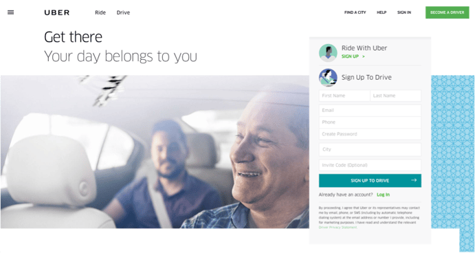
Uber
I really liked their homepage when it was full screen with a video behind it of people in the car, using their service, but I understand why they changed it. They realized they have two very different personas and they need to address both right on their homepage if they want to continue to grow to serve their customers. So the homepage now shows a driver and passenger. It also asks you to either sign up and ride with Uber or sign up to drive right off the bat. It also knew my location without signing it, probably by IP address, and mentions Dallas with smart content on the homepage to personalize my experience.
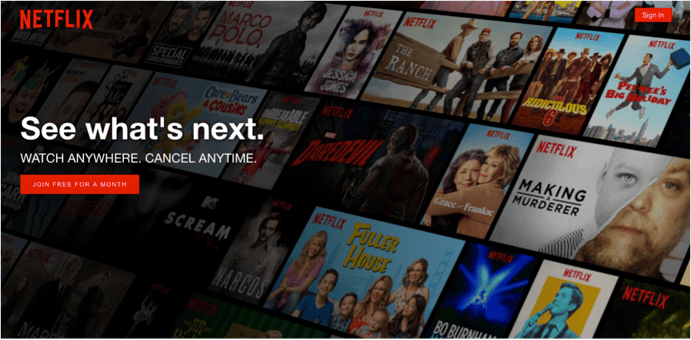
Netflix
Talk about simplicity. There are two CTAs above the fold, one for existing customers and one for prospects. The one for prospects lowers the risk by offering a free month. I don't know if this simplistic would make sense for every business but for them it does and is smart.
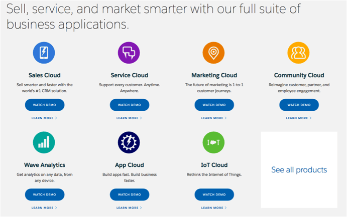
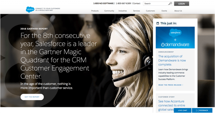
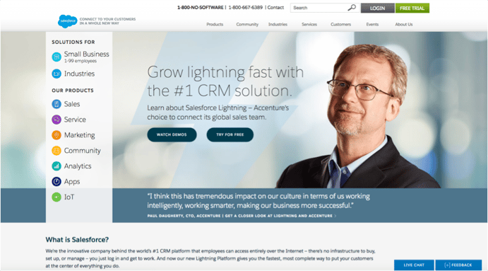
Salesforce
Salesforce does a good job of using smart content with their main image that changes depending on what it knows you about you, and for the version that loads for me, offering calls to action to demo different products all in one place. Pro tip: Do you want to know if a website has smart content and therefore is customizing the content to look different for you than it does for others? Open up an incognito window in your browser and you'll see if like you're seeing it for the first time.
My version:
 Incognito version:
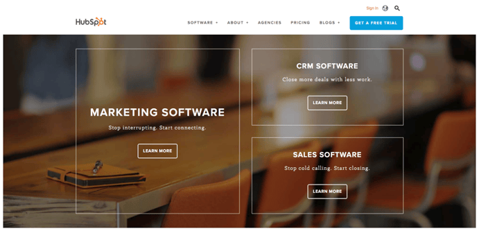
Hubspot
Hubspot does a good job using smart content as well and customizing the three clear calls-to-action to what they think are most relevant to you. See below.
My version:
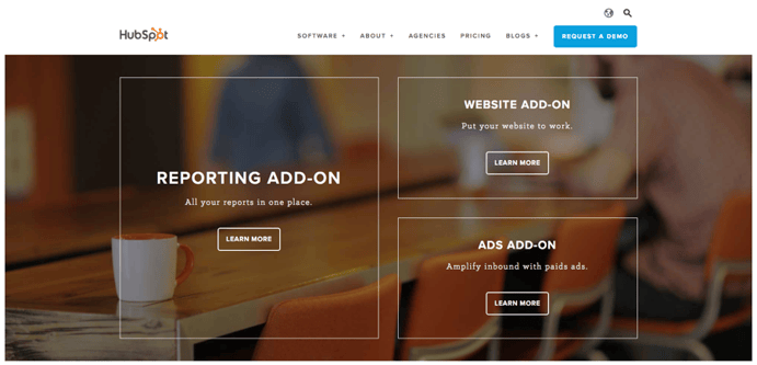
Incognito version:
So there are some ideas for your next homepage and potentially your website. Good luck! And remember, the hardest part is the research beforehand to figure out what you need to do before you can decide how you want it to look and work. Also, your homepage is generally the most viewed page on your entire website, so make it count!


Jackie Connors is the Founder & CEO of Digital Marketing Direction, a top-tiered HubSpot Solutions Partner agency based in Texas. She provides inbound training, consulting, and content marketing services to mid-market companies.
 Email
Email Facebook
 LinkedIn
 Twitter